0. Introduction
a. The following data series and information are provided for students studying Property Analytics.
b. They are grouped together in this GREALAB webpage (https://grealab.weebly.com/property-analytics.html) to facilitate students to bookmark and easy download the required materials for doing the tasks of the Quizzes once every week.
c. They include:
1. Data Collection: Use Excel Pivot Table to Plot OECD House Price Indices of Various Countries
2. Data Visualisation: Use Datawrapper to Plot OECD House Price Indices
3. Data Analysis: Use Excel Scatterplot to Analyse Correlation between Two Countries' House Prices
4. Data Analysis: Use Excel Regression to Analyse Multiple Continuous Factors' Effects on House Prices
5. Data Analysis: Use Excel Regression to Build a House Price Index by Hedonic Price Model
6. Data Analysis: Use Excel Forecast Sheet to Forecast House Price Changes
7. Data Visualisation: Use Datawrapper to plot a scatterplot of global house prices versus rents
8. Data Analysis: Use Excel Pivot Table filter to plot a House median rental index of SA1 NZ
Appendixes
A1. An example of House Price Index
1. Data Collection: Use Excel Pivot Table to Plot OECD House Price Indices of Various Countries
Q. How to compare house prices between countries? Since different countries' house prices are of different currencies, and of different ranges of magnitude, how can we compare them?
Usually, we can convert them into indices with the same starting point, say 100, at the same point in time. OECD data provides such a dataset on more than 30 OECD countries' house price indices (2015 = 100) at https://data.oecd.org/price/housing-prices.htm
However, the downloadable dataset of OECD data is in stacked format, which cannot easily be used to carry out analyses or graph making. The video below, therefore, shows you how to use Excel Pivot Table to convert the stacked dataset to a panel dataset, and plot the house price indices of various countries you choose.
2. Data Visualisation: Use Datawrapper to Plot OECD House Price Indices
Q. How to plot a better line graph?
Excel provides simple graph plotting tools, but the quality of Excel's graphs is not impressive. The video below shows how to use another free web-based application software - Datawrapper to plot the same OECD house price indices.
Excel provides simple graph plotting tools, but the quality of Excel's graphs is not impressive. The video below shows how to use another free web-based application software - Datawrapper to plot the same OECD house price indices.
3. Data Analysis: Use Excel Scatterplot to Analyse Correlation between Two Countries' House Prices
Q. How to find any relationship (correlation) between two countries' house prices?
Regional house prices, for example, are usually said to be strongly correlated or even synchronised, such as house prices of New Zealand and Australia. It can be examined by plotting a scatterplot or calculating correlation coefficient between the growth rates of the two indices. The video below shows how to conduct the correlation test and plot the scatterplot both by using Excel and Datawrapper.
Regional house prices, for example, are usually said to be strongly correlated or even synchronised, such as house prices of New Zealand and Australia. It can be examined by plotting a scatterplot or calculating correlation coefficient between the growth rates of the two indices. The video below shows how to conduct the correlation test and plot the scatterplot both by using Excel and Datawrapper.
4. Data Analysis: Use Excel Regression to Analyse Multiple Continuous Factors' Effects on House Prices
Q. How to use Excel Regression to analyse Hedonic Price Model on House Prices?
Correlation analysis is only good at analysing two variables' relationship, but in reality there are always more than one factor affecting the other. It requires conducting multiple regression analysis. Thus, the following video shows you how to use Excel Regression to analyse multiple continuous factors on house prices, i.e. conducting a simple Hedonic Price Model on House Prices. The video will also demonstrate how to interpret Excel regression results with numeric examples, and how to install the Excel Regression add-in.
The housing transaction data for testing is available below.
| house_prices_akl_2017_flr_area_bed_bath_regression.xlsx |
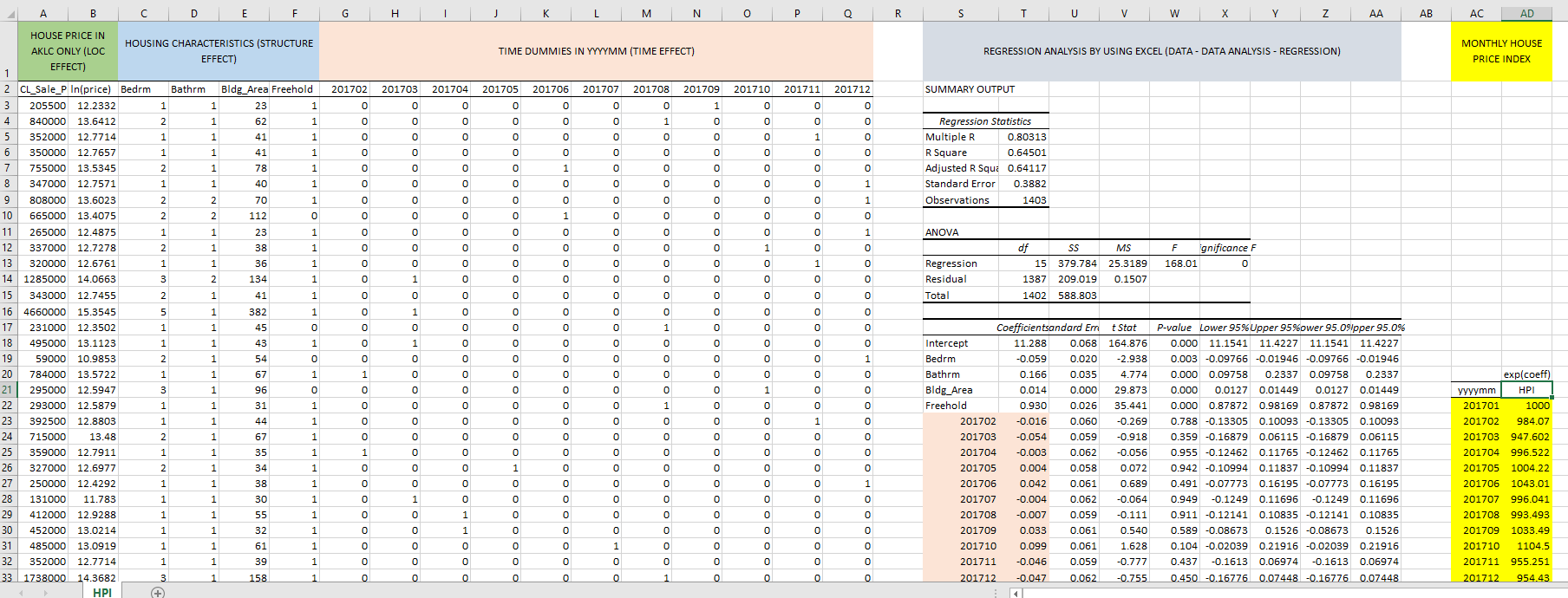
5. Data Analysis: Use Excel Regression to Build a House Price Index by Hedonic Price Model
Q. How to use Excel Regression to Build a House Price Index by Hedonic Price Model?
Extending the above Hedonic Price Model to include time dummies in the independent variables, the coefficients estimated for the time dummies represent the time effect on house prices, ceteris paribus (keeping other factors constant). This is a typical method to build a house price index. The following video shows you how to use Excel Regression to include monthly time dummies as independent variables of the above Hedonic Price Model on House Prices. The video will demonstrate how to convert the estimated coefficients to a house price index with a numeric example.
The housing transaction data for testing is available below.
| house_prices_akl_2017_flr_area_bed_months_regression.xlsx |
6. Use Excel Forecast Sheet to Forecast NZ House Price Changes
Q. How to use Excel Forecast Sheet to forecast house price changes in the future?
For latest versions of Excel in Windows, a new Forecast Sheet function is provided to forecast a time series. Unfortunately, so far it is not yet available in Mac computers or old versions of Excel. This video shows you how to use Excel Forecast Sheet function to forecast the New Zealand house price changes based on the Reserve Bank of New Zealand's house price index time series. The video also demonstrate the underlying forecasting method by using a Sine function plus a linear trend.
The house price index data of the Reserve Bank of New Zealand can be downloaded from the website mentioned in the video for testing.
7. Data Visualisation: Use Datawrapper to plot a scatterplot of global house prices and rents
Q. How to plot a better scatterplot?
Excel provides simple scatter plotting tools, but the quality of Excel's scatterplots is not impressive. The video below shows how to use another free web-based application software - Datawrapper to plot a scatterplot of global house prices versus rents.
Excel provides simple scatter plotting tools, but the quality of Excel's scatterplots is not impressive. The video below shows how to use another free web-based application software - Datawrapper to plot a scatterplot of global house prices versus rents.
8. Use Excel Pivot Table filter to plot a House Median Rental Index of SA1
Q. How to use Excel Pivot Table filter function to plot a quarterly median rental index of SA1, New Zealand on house type dwelling?
From MBIE Tenancy Rental Bond data available at https://www.tenancy.govt.nz/about-tenancy-services/data-and-statistics/rental-bond-data/, there is a Detailed quarterly report on rental bond data of each SA1, New Zealand.
However, the downloadable dataset of rental bond data is in stacked format, which cannot easily be used to carry out analyses or graph making. I have demonstrated in video 1 above on how to use Pivot Table function to convert the stacked dataset to a panel dataset. This video below further shows you how to use Excel Pivot Table filter to plot median rental index of house type dwelling only.
Appendixes
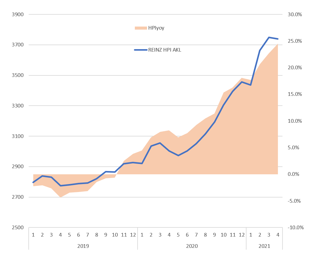
A1. REINZ House Price Index of Auckland
A monthly house price index of Auckland (and other regions) is available at the REINZ's Monthly House Price Index Report at •https://www.reinz.co.nz/residential-property-data-gallery
| reinz_hpi.xlsx |
A2. Appreciate the Importance of Data Analytics - Tracing COVID-19 by Our World in Data
|
a. Powerpoint on Data Analytics - Our World in Data
|
| ||
|
b. How to process panel data series by pivot table? A panel data file on the Number of New Confirmed Cases by Country by Date downloaded from Our World in Data (to save size, only the World, the UK, the US data are extracted)
|
| ||
c. Comparing the mortality rate - a scatterplot by the John Hopkins Coronavirus Resource Center at •https://coronavirus.jhu.edu/data/mortality
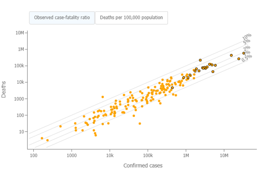
d. Yiu, C.Y. (2021) An article interpreting the scatterplot to identify which country has the lowest case fatality rate of COVID-19, Medium, Feb 20. https://medium.com/discourse/which-country-has-the-lowest-case-fatality-rate-of-covid-64400d5a8d8
A3. Housing Trading Challenge

a. A Template for Fund Allocation and Performance Calculation -
Housing Trading Challenge is to simulate trading a spatial portfolio of housing properties in New Zealand using live market data in our GREA LAB environment, it is fun and an experiential learning process. You can track your performance and see if you can outperform your peers. It provides hands-on experience on the portfolio theory and diversification of risk in property investment.
Housing Trading Challenge is to simulate trading a spatial portfolio of housing properties in New Zealand using live market data in our GREA LAB environment, it is fun and an experiential learning process. You can track your performance and see if you can outperform your peers. It provides hands-on experience on the portfolio theory and diversification of risk in property investment.
| housing_trading_challenge_template_jun2021.xlsx |
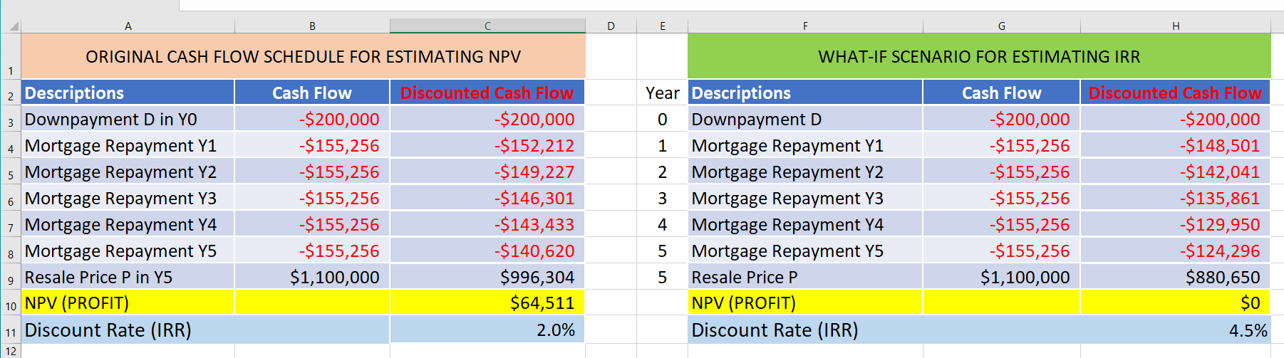
A4. NPV and IRR Exercise
| npv_irr_exercise.xlsx |
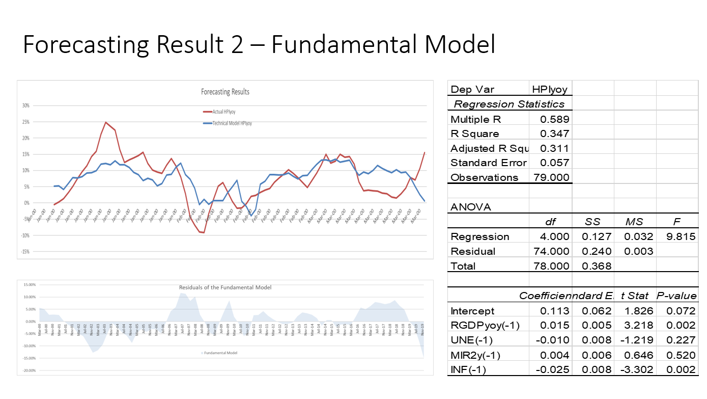
A5. A Template for Forecasting House Price Change by Technical Model and Fundamental Model
a. Powerpoint on Data Forecasting - House Price Forecasting Game
| 8_forecasting_-_house_price_forecasting_game.pdf |
|
b. A data file and template for the forecasting of house price change by Technical Model and Fundamental Model
|
| ||
A6. Build the 1st AVM in Colab
Nowadays bankers and real estate agents can almost immediately get a guesstimate of a house price by a Mobile-App by specifying housing attributes. It facilitates mortgage borrowers to know better how much can they borrow from the bank. A Residential Automated Valuation Model (AVM) runs a machine learning algorithm that accounts for the house’s size, number of rooms, housing quality attributes, etc. to make an up-to-date house price predictions. Simply put, it is a house price predictor.
Let's build our first AVM, here provides the tools and guidance:
1. a simple data file template (akl_housing_prices_2017_template.csv) of housing transactions in Auckland Center in 2017 is provided, you can add more data to try - a csv file below;
2. an article and a Youtube to explain how to code in Google Colab to use sklearn.linearregression algorithm to estimate house price by housing attributes;
Yiu, C.Y. (2021a) Build My First AVM by Sklearn in Colab, Medium, June 7. https://ecyy.medium.com/build-my-first-avm-by-sklearin-colab-2db661c67b95
Yiu, C.Y. (2021b) Build My First AVM by Sklearn in Colab, Youtube, June 7.
| akl_housing_prices_2017_template.csv |
